How A/B testing improves your conversion rate

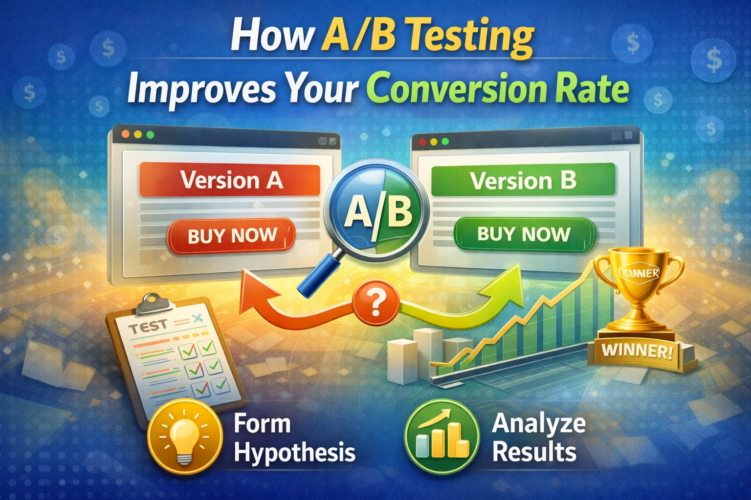
One of the best ways to fine-tune your site and improve your conversion is through A/B testing. Also called a split test, an A/B test is a method of experimentation that compares two versions of a web page to measure performance. For example, you might create a new landing page and then test it against your existing page to see which one performs better. You can also test elements of the page, such as a new button color, homepage headlines, or adding a sales video, to see which one leads to more clicks.
A/B testing process
A/B testing involves the following steps:
Determine your goal
Before you start A/B testing, it's essential to identify your goal. If increasing sales is the objective, look at what needs to be changed for this plan of action to work best: is it making the website more interactive, using specific colors, using catchier copy, etc.? Once your KPIs and metrics are selected, you can measure the more successful version.
Set a hypothesis
What hypothesis do you want to test? What do you think will increase conversions? What changes would you make, and what do you think will happen due to those actions? This is an excellent way for marketers to get insights into what works and doesn't work in their campaigns. It also helps with testing new ideas to determine the winning campaign.
For example, if we were looking at banner ads – one theory might be "new" versus "used." But how do these two ad sets differ from each other? What does "new" mean here – did someone upload it last week, or have you been running them continuously since June?
Test and analyze
Launch the variant web page while assessing the control. The control is the current web page without the changes. Compare results by measuring KPIs. Analyze the data to find out which performed better.
The benefits of A/B testing
Easy to get started
The beauty of an A/B test is that it is quick and easy to set up. You can start with a small budget and a small team. Plus, you don't need a major overhaul of your website – often, you can test a minor tweak, which can make all the difference.
Test data helps to understand your users and make better decisions
You can learn more about your users through data from an A/B test. What do they like or dislike about your site? How do they behave on your landing page? And best of all, you can use data from your A/B test to make informed decisions about future changes to your site.
Examples of A/B tests
- Google SERP Test – Google wanted to know how more ads on their search result pages impacted revenue. The team found that adding more ads to search result pages decreased user clicks on the ads but increased conversion rates. People searched for products or services less often and bought them from ads instead.
- Facebook tweaked its website colors and saw an increase in user engagement.
- By testing two different home page designs, Amazon found that one of them was more successful in driving sales.
These are just some examples, but you can use A/B testing for landing page copy, product testing, website design, and more.
When should you run an A/B test?
You don't need to A/B test every time, but there are times when it makes sense to do. You might consider running an A/B test when:
- making significant changes to your SaaS product
- introducing new features or modifications to existing ones
- redesigning your website
- testing marketing campaigns
- optimizing for conversions (like checkout processes)
What is the right sample size for your A/B test?
There's no 'right' size, but generally, the bigger, the better; otherwise, you might just be seeing a fluke. The right sample size will vary depending on several factors, including the expected effect size, the variability of metrics, and the desired conversion rate. Most experts recommend using a minimum sample size of 500 per variant. So if you're testing two variants, your minimum sample size would be 1000. You can also try free online sample size calculators to help you figure it out.


